Capstone 1: Scent Palette
“Scent Palette is an inspiring purpose that helps people try new products and discover solutions in an easy, friendly, and efficient way.”
Introduction
Overview
People tend to have difficulty when they look for the right perfumes for themselves. A lot of them these days think it is very important to have their own fragrances as a means of expression (personality, uniqueness). We arrived at this problem after often confronting this situation when trying to buy new perfumes as well.
Challenge
Problem: Perfumes are considered to be high-priced items, it’s extra important for consumers to get value for their money.
Solution: Created an app to help consumers/users own signature scents by providing various samples in an efficient way.
Role
Role: UX Designer
Timeline: 4 months
Platform: Android Mobile App
Team: Bart Mach, Justyna Mach, & Hee-gwon Jung
Approach
Secondary Research (via Google)
Heuristic Analysis
A Screener
User Interviews
Primary Research (Affinity Map, Empathy Map, & Personas)
User Flows (via Miro)
App Usability Testing (via Marvel)
Website Usability Testing (moderated)
Results
The whole process helped us decide what we should prioritize for users’ needs. It was a valuable and pleasurable experience to understand how we would help users in different ways.
The Process
Secondary research by Google
↓
Heuristic analysis to discover the weakness and strength of our competitors
↓
Made a screener and spread it to identify who we should interview
↓
Interviewed 5 users out of 20
↓
Conducted primary research based on what users said
↓
Made user flows via Miro to make our goals clear.
↓
Drew sketches for the first design
↓
Made the sketches clickable by Marvel and did user testings
↓
Started making real prototype using Figma
↓
Conducted moderated usability testings
The Research
Research No.1 - Secondary Research
We researched through Google and found appropriate resources from reliable websites.
The main goal was getting further understanding about users (mostly beginners).
We learned there are multiple ways for everyone to reach into the fragrance world in easy ways, not making them feel super overwhelmed.
Our first research gave us a direction which way we should take and prioritize to satisfy the users.
Research No.2 - Heuristic Analysis
We found potential competitors (Nose Paris, Fragrantica & Sephora) and conducted heuristic analysis (Visibility of System Status, Aesthetic and Minimalist Design, User Control and Freedom).
We tried to identify the similarity of services they offer and common products they sell. Also we focused on learning from their weaknesses and strengths.
We found each website had both strengths and weaknesses.
For visibility of system status heuristic, Sephora was stronger, while the rest of two of them lack some factors that we value (accurate number of users and reviews).
When it comes to aesthetic and minimalist design, Nose Paris and Sephora did a decent job with clear design, but Nose Paris was dominant at this part. Fragrantica definitely has to be more organized with content, so users are not distracted.
Finally, for User control and freedom, although there were convenient ways for users to access the basket, we could see that each website had weaknesses.
We would give Sephora the highest score for the easiest accessibility among all. It was easy to see what is inside the basket by looking at the pop-up before going to the actual checkout page. On Nose Paris, however, it was not possible for users to see the cart before the checkout page. Fragrantica did not do a great job on the settings part of the website, so it would take time for users to figure out how to add, remove, and switch fragrances.
We had a great opportunity to make us decide what to add or not to add on our future app. We also learned that it is important to keep user-centered design in our mind.
Research No.3 - A Screener
We made a screener and spread it to potential users (age 20 to 40) to screen out who would be the most appropriate for our interviews.
We discovered 5 participants out of 20 (all 30s) and learned that it was cost-effective for the whole process and easy to find participants in this way.
Research No.4 - User Interviews
After we selected 5 users, we conducted interviews with them.
Our main goal was listening to their fragrance journeys and how they feel about them.
This was a great opportunity for us since we could see what made them frustrated the most. Most of the users were confused about specific scents and did not know how to find fragrances in an efficient way.
We learned how to set our new goals to help our users. We conducted key findings from our interviewees:
High Priority
Letting them realize what kind of scents they are attracted to
Medium Priority
How to make users to get fragrances in a cost-effective way
Low Priority
How to make users to go through every process smoothly in an app
Research No.5 - Primary Research


After hearing all their concerns and hopes, we started to do primary research via Affinity Map, Empathy Map, & Personas.
We tried to see their pain points in a visual way, so we could understand them further. Here are the links for better understanding about our process and taking a closer look:
We could distribute users into 2 types:
User 1 types (beginners) are neither certain what scents they like or have difficulty describing scents
User 2 types (intermediate) are aware of what scents they like, but still difficult for them to find right fragrances
We came up with 4 HMW questions from this research:
How might we help them find their signature fragrances?
How might we let them know what scents they are attracted to?
How might we make it possible for them to distinguish specific scents?
How might we introduce the best way to get fragrances to them?
The Design Iterations
01. User Stories & Site Map via Miro
After we collected all the information from our users, we made user stories and a sitemap to identify the functional needs of the product (in our users’ shoes, of course) and to visualize how the actual app would be shown and connected for further designs:
https://docs.google.com/spreadsheets/d/12604syx0ClGyoBu2I9ujwsgx-yaq8VTXlnpFDLNgkcA/edit?usp=sharing
We could see what new users would need in detail for our app and it was easier to see it when we collected and made them out of the sitemap.
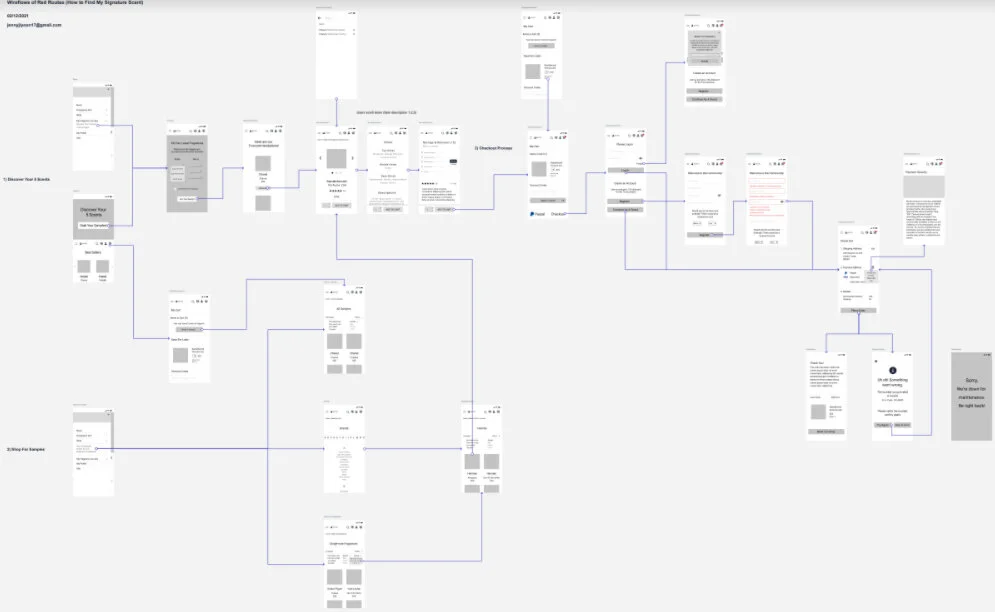
02. User Flows (Red Routes) via Miro
We made user flows to make a clear visual presentation for the red routes: https://drive.google.com/file/d/1F2i4eoyrNOcAitsKPWVWZQ0DBCi74gRe/view?usp=sharing
In this process, we decided to make 3 red routes which are considered to be critical in our design:
Olfactory Diagnosis
Allows users to do a small test to figure out what scents they are attracted to
Shop for Samples
Makes users shop for items with detailed descriptions
Checkout Process
Makes users go through smooth, effortless checkout process without frustration
The most important lesson we learned here was the more we consider about user needs, the more details we should think of.
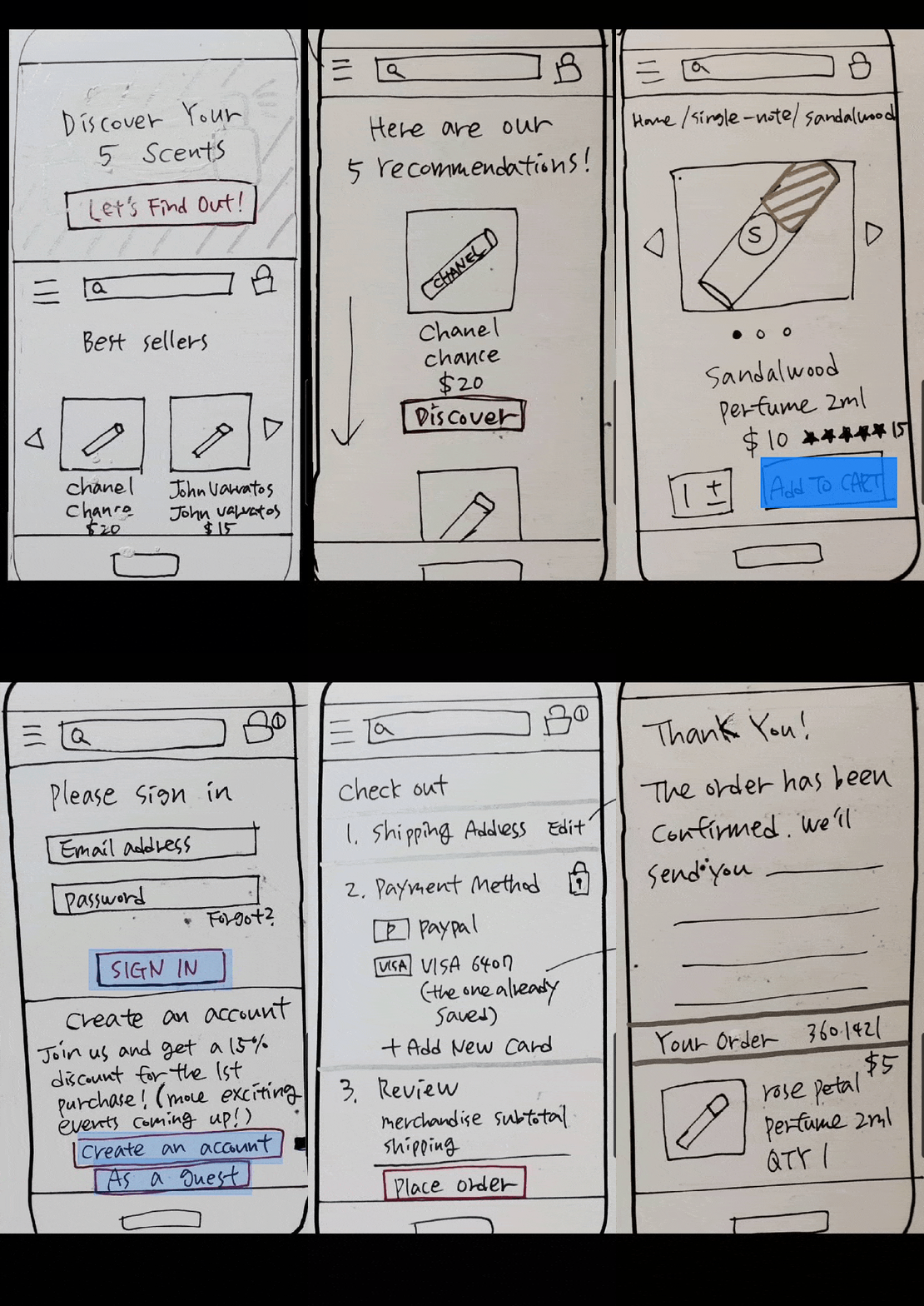
03. Sketching Red Route Screens


We ended up drawing sketches of every red route to make our ideas tangible and to make it easier to be tested. I also helped us adjust before the high-fidelity (both mobile and desktop):
https://drive.google.com/drive/folders/1MfeJoy0a6EEZvIzBHvTG-KpGZpD-_HnP?usp=sharing
In this part, we changed a term which could confuse users (olfactory diagnosis → discover your 5 scents). We focused on making every detail in a user-friendly way.
Through the whole process, we identified which part we should emphasize (CTA buttons, etc). We decided the visual hierarchy should be also important.
04. App Usability Testing via Marvel
For usability testing with 5 participants, we used Marvel to make CTA buttons clickable: https://marvelapp.com/9b9eai3
Our goal for this test was to examine how smoothly users can go through each step (red routes) by using the app.
The participants easily could go through each step without problems. They understood how the app worked, but I have got some questions that we haven’t expected.
How would you differentiate the characteristics of this app from others?
Is there a mission statement and more details about this app?
After we got some feedback, it became much clearer what we should think of when we have to turn it into a wireframe.
05. Wireframes of Red Routes via Figma


We finally worked on wireframes to map our product’s content. Since we realized how important visual hierarchy would be, we focused on defining the hierarchy:
https://drive.google.com/drive/folders/1VprbVyoEhZItOT7h0jZjKfsUh7qyNgA1?usp=sharing
From the users’ feedback on the usability test, we worked on some details so that users can understand our app much easier.
To make sure to differentiate our app from others, we changed the wording of the CTA button on the main page from ‘Let’s Find Out’ to ‘Grab Your Samples’.
Since putting the mission statement wasn’t one of the red routes, we decided not to add it as one of the pages. Instead, we added more information and details (notes, descriptions, ratings, and reviews) to help users understand further.
By using Figma, we could see our design coming into life clearly, which made the whole crew very excited.
06. Wireflows via Overflow
From the wireflows, we tried to combine wireframes and user flows, as it should be. It was especially an interesting experience to work on the wireflows using Overflow since we could make which button should be actually clickable or not. Here is the link: https://drive.google.com/drive/folders/1c51b3DeZGVq1ZB9Vh2TIaYqqjkV3mdF0?usp=sharing
At first, it seemed a bit complicated to make each screen connected, but our effort paid off since we could see the design in a much clearer way (which way users should go, what they should click, etc).
It also helped the front-end developers to understand how the flow goes on the app.
The Results and Next Steps
High Fidelity Mockups


Finally, we have the high fidelity mockups after a long journey. Here are the links for better understanding about our process and taking a closer look:
High fidelity mockups: https://drive.google.com/drive/folders/1nCbKnim_rOVwgiK5_4BGctgK9c8IIWT1?usp=sharing
Usability testing on InVision:
https://jennyjung535745.invisionapp.com/console/share/9S2IIGYDWR
Not only did we concentrate on the wireflows, but we took it seriously for this app to look pleasurable and useful with visual hierarchy. Unlike the low-fidelity wireframes that we finished earlier, we could see the app was getting more tangible by putting some features. The features that we focused on this part were:
Rearrangement of Scent Palette logo and icons on the header
Alignment of each element (text fields, CTA buttons, etc)
Accessibility
Color scheme (Green as a primary color and pink as a secondary one)
Choosing the right backgrounds that fit the image of our brand
We were so happy that we finally completed the usability testing with our 10 new participants. InVision was a helpful tool to make this possible and we’ve got some valuable lessons from our users’ feedback.
The whole design turned out to be more successful after we fixed some elements that users pointed out (inconsistency of photos, descriptions, and filters).
Next Steps
From the usability testing, we learned the more communication we have with users, the easier to understand them. Since Scent Palette has an inspiring purpose that helps people try new products and discover solutions in an easy, friendly, and efficient way, we decided that it is important to highlight what our next features would be and what users would like to see.
Provide more details about fragrances
Offer a variety of brands
Option to reach to discount fragrance websites when users want full bottles
Ability to search and find brick and mortar stores nearby users’ locations when they want testing


