Design Sprint: GalleryPal
Introduction
Overview
GalleryPal wants to design a way to improve the experience of viewing art in a museum or gallery. They want a UX designer to help them out and test out a possible solution. The whole process was a modified GV design sprint.
Challenge
Some people are frustrated when they can’t find as much information as they want when they visit a museum or gallery. We want to help them out to get detailed information in an easy and user-friendly way.
Role
Role: UX Designer
Timeline: 1 week
Platform: Android Mobile App
Team: Bart Mach, Justyna Mach, & Hee-gwon Jung
Result
The main goals for our targeted users were successful, although we still see some details we have to work on. We learned that there are a lot of things to come up with even for 5 days. We also learned that there is no perfect design for everything, and we have to stay humble and try to see designs in users’ perspectives.
The Process
Drew a map of a possible end-to-end experience
↓
Did a review research and personas
↓
Researched competitors
↓
Drew crazy 8s screen sketches to select the most critical screen
↓
Made a three-panel board of
(1) the screen that comes before your critical screen,
(2) the critical screen itself, and
(3) the screen that comes after your critical screen
↓
Made a seven-panel storyboard to proceed with our solution
↓
Built a prototype via Marvel to make the design tangible
↓
Conducted usability testings with 5 participants
Day 1 - Understand / Map
1) Understand the Problem


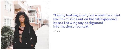
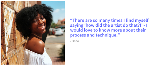
First of all, to see how visitors feel about experiences and pain points, we conducted a research by asking some visitors to tell us about a recent time they visited an art museum or gallery.
2) Persona: The Story of Angela
It was interesting to find that there are so many common feelings and frustrations among interviewees.
For the further understanding of visitors, we decided to pick one person, Angela, as a representative and built a persona. Here is a link for a closer look: https://drive.google.com/file/d/19HP0wB8TnLYvTYRondoCHsa3S4HB5zIe/view?usp=sharing
What frustrates Angela the most is that she feels overwhelmed at the long, in-depth information about pieces. She wishes that she could get quick information and know more. What should we do to satisfy her?
3) Map
To find out how we could improve the experience in museums and galleries, we drew a map of a possible end-to-end experience.
What we were trying to figure out first was providing visitors all the detailed information in a user-friendly way.
To make it possible for visitors to make the most out of the visit, we ended up deciding to divide the screen into 2 sections:
Scan a barcode of a piece, or
Find a piece that visitors want to take a look at
We wanted to make it possible for them to read the contents, to listen to them by clicking on a speaker icon, and also to watch a video.
At the end of this process, we also recruited 5 participants that we will do usability testing with.
Day 2 - Find Competitors / Sketch the Solution
1) Competitor 1 - Museum of Fine Arts Boston
We found a website for the Museum of Fine Arts Boston very inspiring: https://www.mfa.org/
First of all, on the main page, we could see the very minimalized and neat UI by using only two main colors (red and white). It made the contents relatively stand out and made a good visual hierarchy.
Second of all, they had well-organized contents of each piece, so visitors can learn more details about pieces before their visits. On top of that, we found there’s a special audio guide app that visitors can use to read and listen at the same time.
02) Competitor 2 - J.Paul Getty Museum
We also got inspired by the website of J.Paul Getty Museum: https://www.getty.edu/museum/
For UI, Getty used only two colors, blue and white, and gives visitors relaxing vibes. They also provide detailed information about each piece.
One thing we got impressed about Getty was they offer detailed, zoomed-in photos of pieces, so visitors can take a look at pieces more closely even before their visits.
Furthermore, Getty provides a free app that visitors download in advance, so they can use the app just as their personal guides.
3) Crazy 8s Sketch Exercise
In these 8 sections of sketches, we tried to prioritize a few screens which could be critical to museum visitors. We thought scanning a barcode would be important to visitors, so they can easily scan it when they want further information about a piece (the barcodes should be on a note next to each piece). If they simply want to read more information without listening to it, they can also do that.
We divided scanning and finding a piece into 2 sections in one screen because it would make visitors choose whichever they like. Once they click on each piece, we would want to make sure if they are on the right location and ask them by showing them a map of the floor they might be on and a CTA button ‘I’m here’. They can also see the whole version of a map by clicking on the map.
Once they click on each piece, they can see the photos on the top and two sections of audio tour and descriptions. They can see zoomed-in photos in different angles by swiping from left to right. The descriptions include more information such as history, artists’ intentions, techniques, etc.
Furthermore, they can do an audio tour by listening to it (includes the same information as descriptions).
04) A Solution Sketch
Since a lot of museum visitors are disappointed at the amount of information that is covered on the note next to every piece, we decided that helping visitors to learn further information about pieces (history, intentions, techniques, etc) is most important.
We wanted them to choose between scanning a barcode and clicking on pictures of pieces. Each section will lead them to the third screen, which could show pieces that visitors want to see. They can select to listen to an audio or to read detailed descriptions (Each has the same contents).
Day 3 - Storyboard
We decided to make each screen with more details for a critical path that users have to reach.
The app starts with a friendly message ‘welcome’ on the main page and leads visitors to the pop-up that requires them to turn on their location for easier access to the pieces.
After visitors choose one of the options of the pop-up, they can see a screen that they can choose scanning or simply taking a look at pieces. Each option goes to the same screen where users can select an audio tour or descriptions.
They can see the full-width videos and listen to them by clicking the audio tour, and also can see some descriptions under. The video can rotate by clicking on the icon under the screen (on the right side). Also, if users want to see more details, they can simply click on descriptions.
Day 4 - Prototype
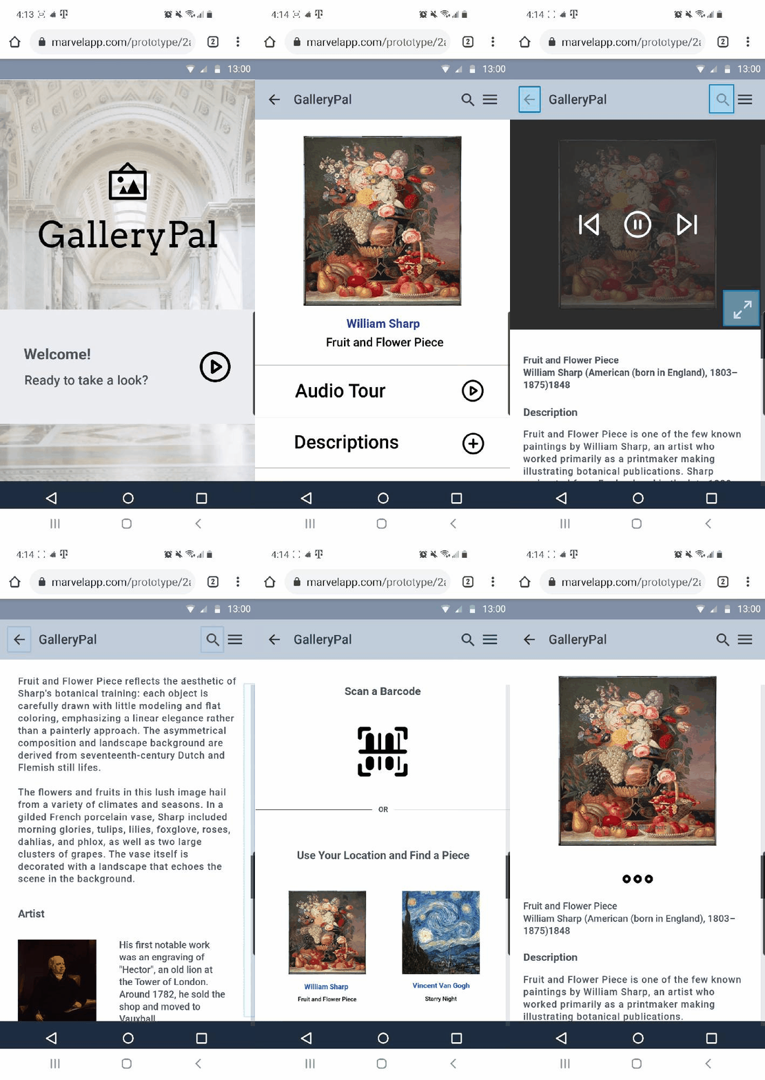
The main goal for this prototype was to make our sketches and designs tangible. We could finally see how our design would look in real life:
Marvel
We decided to put some light colors (beige and grey) and stay minimal to let users focus on pieces and contents. Our idea was making each piece stand out on the negative space.
As soon as users pass through the home screen, we ask them to turn on their locations to show them pieces on the floors they are in.
We made audio and descriptions have the same contents on it except only the audio part has a video. The video would contain extra photos of artists and pieces with sound.
The description part contains more detailed (close-up) photos and allows users to click on other works by the artist that they might be interested in.
We wanted to make sure if visitors could get enough information about pieces (history, techniques, intention of artists, etc). We were excited to see if our 5 participants of usability testing can explore and find what they want in our app easily.
Day 5 - Validate / Test
On the last day of the design sprint, I tested the prototype with 5 participants we recruited on the 1st day. We tried to get some ideas of what users think and what we can improve more from their feedback.
The tasks we concentrated during the test session was:
The first impression of the app
If users can take a look at pieces through a barcode
If users can simply see pieces on the floor they are in
If users can find specific artists or pieces
If users can listen to information of any pieces
If users can read descriptions and learn further
We watched the behavior of each participant during the test session and answered the questions. Here are the insights from the usability test:
Pros
Clean and basic UI
They liked colors for background and for the header that don't dominate and are not overwhelming.
Clear contents
They also gave us compliments that all the contents were clear and easy to read.
Easy accessibility
They liked how easily they could access each screen.
Cons
Descriptions about a barcode
Some of the participants were confused about what the barcode is for. They wanted us to make it more specific what it was about and how to use it (e.g. “Do you want to see more information? Find a barcode next to the piece and scan it!”)
Permission for a camera
To make this whole process more secure, they wanted to see a pop-up of the permission for a camera before they turned on the camera app for a barcode.
The order of a couple of screens
They thought that it would make more sense if some steps came first before others (e.g. Permission on Google’s location → Find a piece on the floor where users are located).
Next Steps
It was interesting to see how users reacted to the screens and what they felt about them. It was a great experience to look at the design again from the users’ point of view. From their feedback, we found what users would like to see and decided to keep working on some details to make it more improved.
Put more descriptions about a barcode
Allowance to turn on their cameras
Change the order of screens for better understanding


